Deliverables
Identity Redesign
Brochure
Stationary
Need It Most
Need It Most is an enterprise dedicated to providing quality and professional household services to clients at affordable prices. They develop meaningful client relationships built on integrity and satisfaction.
Identity Redesign
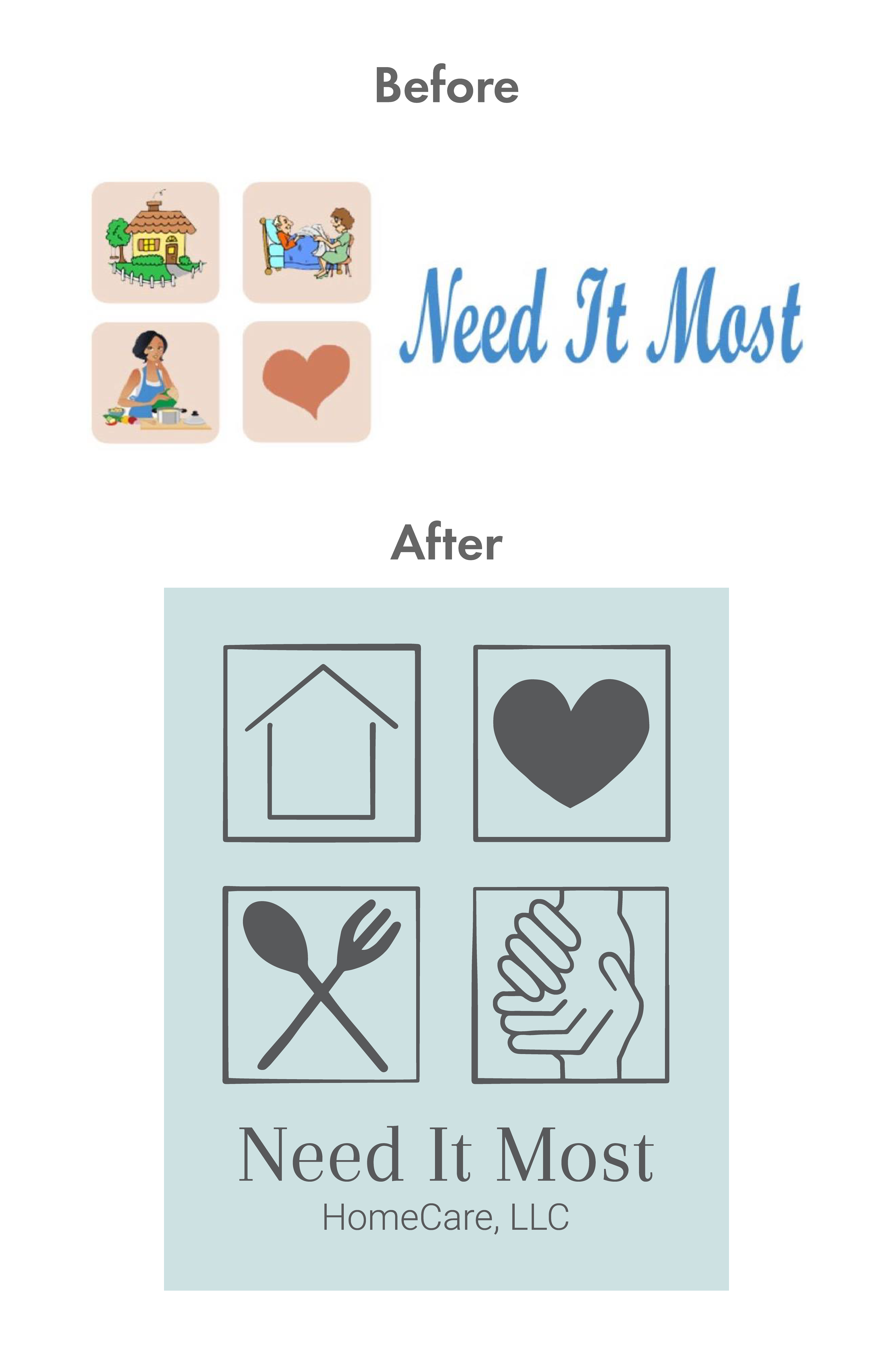
Need It Most came to me to update their logo. They needed a more enticing identity - one that would make them stand out and communicate quality. They wanted to keep the imagery of their business - home, personal, nutrition, and care - the same. I designed simpler imagery to help communicate those words. I also made the typography more professional and easier to read. While pink is a color of warmth and care, I chose mainly a muted teal to feel more approachable, trustworthy, and cleanly.
Branded Marketing & Stationery
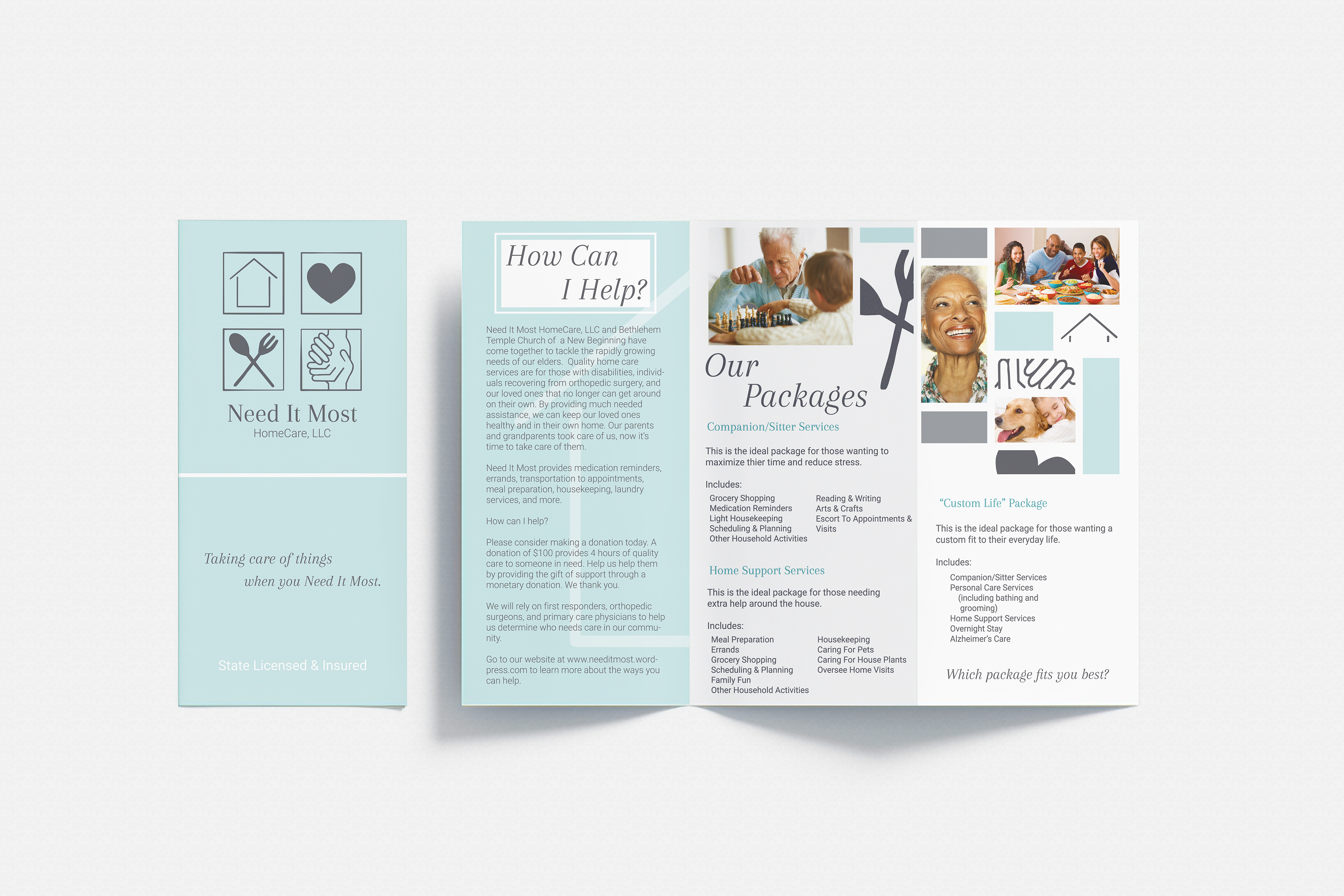
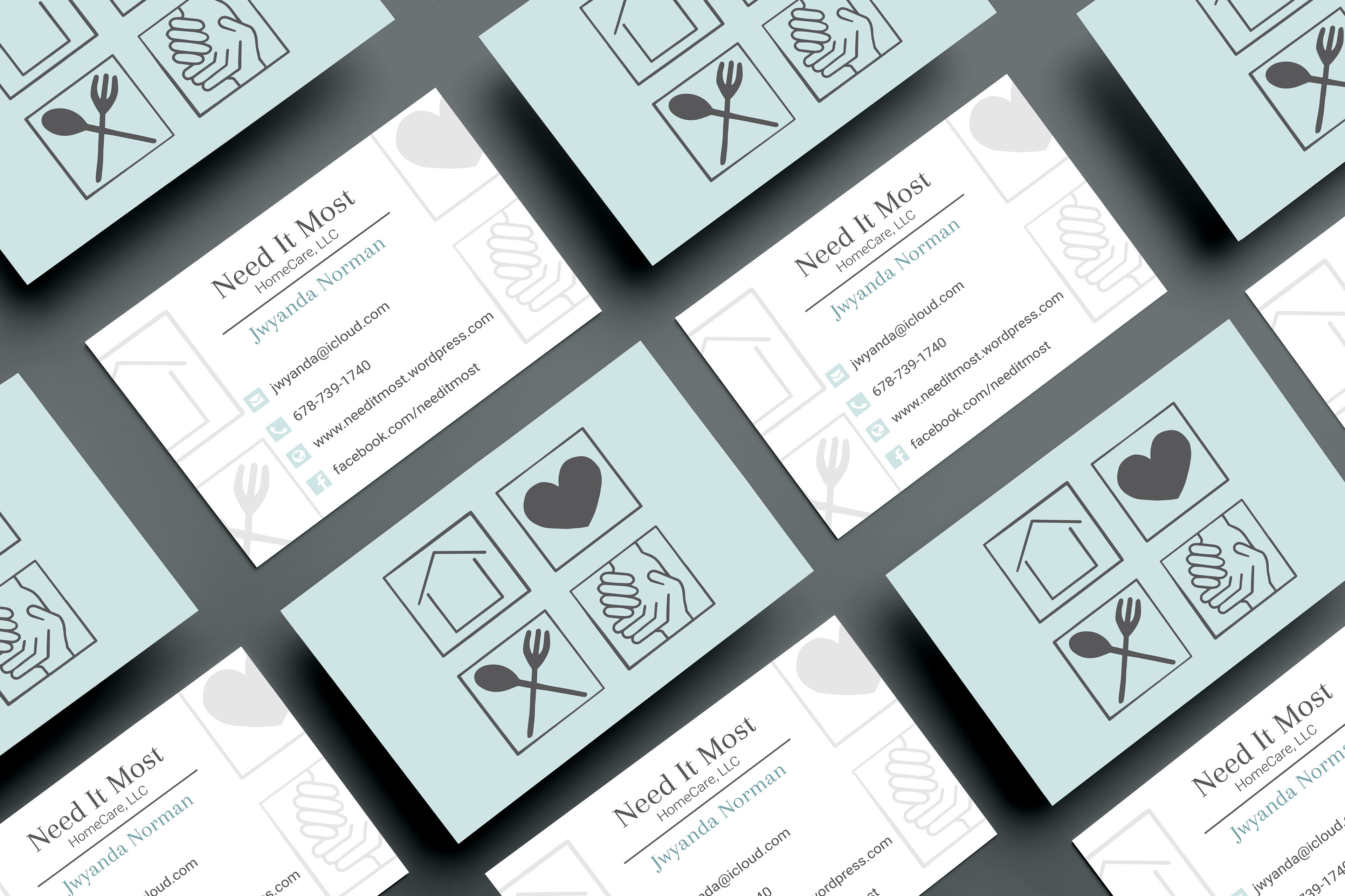
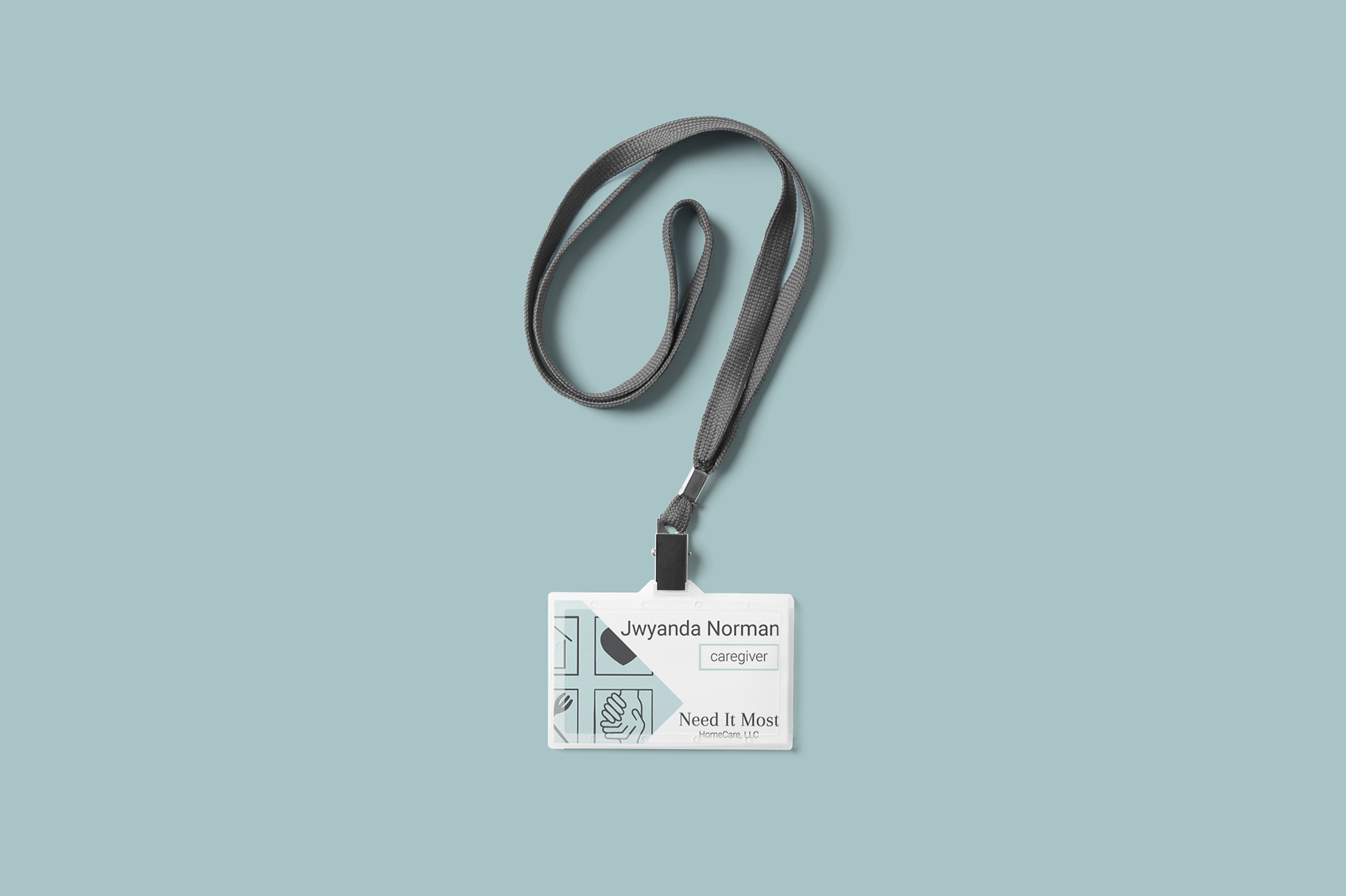
To help deliver the new brand, I redesigned the existing brochure to incorporate the new brand elements. I also designed some simple stationery for the business to use to maintain a cohesive brand.